You may remember my mentioning The Voice Bible before. I liked it then (and now) because it focused on the Bible as something meant to have an IMPACT. They had artists, musicians and poets on their translation team.
Now I found out about The Word On Fire Bible. It seems like it will be a great companion to The Voice! It focuses on ART and BEAUTY. Here is how they put it:

You can find out more about it directly from their website here:
=> The Word On Fire Bible (official website)
The Word On Fire Bible includes portions of various commentaries to help explain the text … but it also not only includes ART and PHOTOS but a commentary on them as well. Here is how they put it:
Each piece of artwork is accompanied by an essay to connect the work to the Scriptures. As you reflect, you are invited to draw nearer to Christ through the way of beauty.
Also, it differs from the St. John’s Bible which was handwritten in calligraphy plus included artwork commissioned just for it! The Word On Fire Bible includes prints of existing art, both centuries old as well as modern. It also includes photos of artwork such as these stained glass windows:
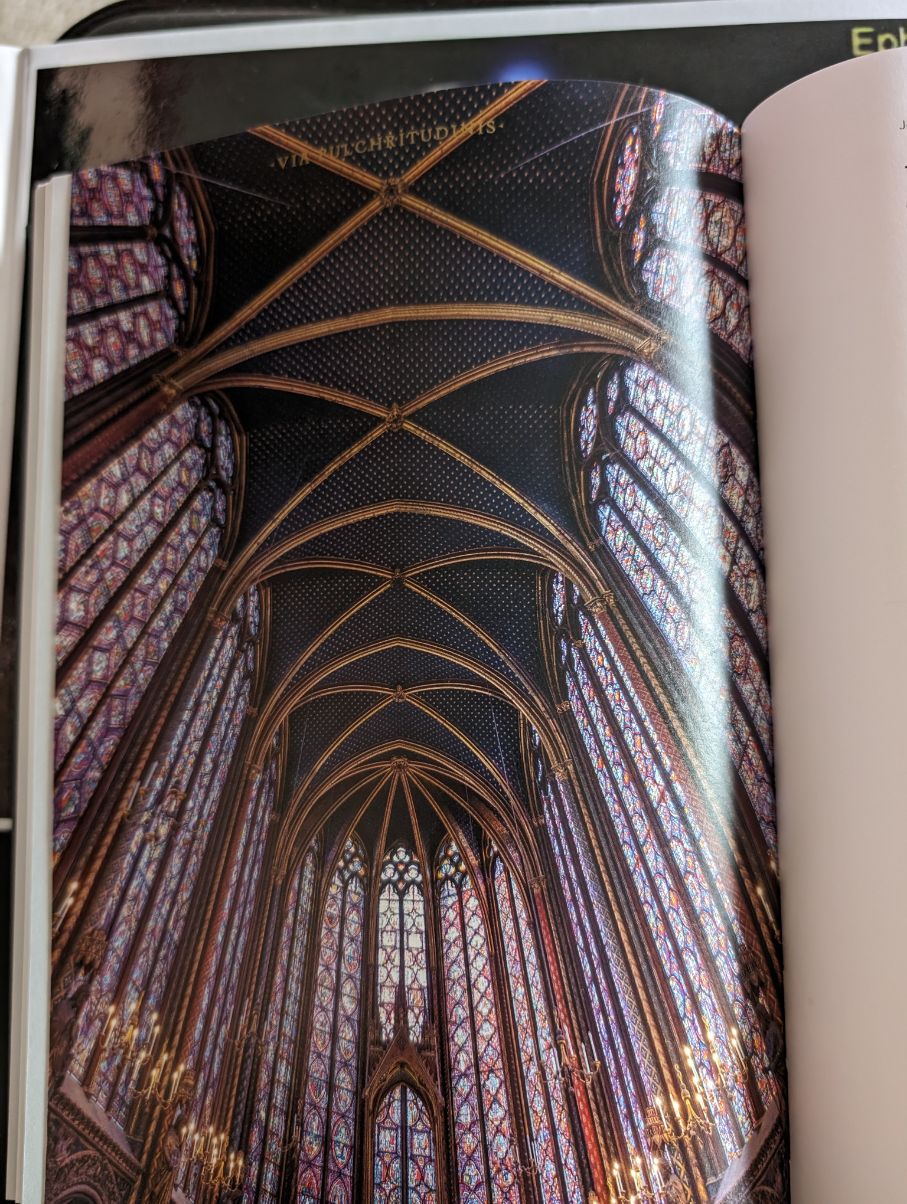
But even better is the essay that explains the ART! For example, here is the page that talks about those stained glass windows:

NOTE: The Word On Fire Bible is printed and bound in Italy!
I have the first volume (The Gospels) and am getting the other two available volumes. They have split the Bible into 7 parts, just like we did with our Handwritten Bible! And if you are interested in ART inspired by the Bible, you might wish to take a look at all the art from the Handwritten Bible … you can get it as a hardcover book as well as a free eBook … read about it here:
=> Handmade Art (gives you goosebumps)
Note: the price to get your own copy of the book is a very very special price courtesy of Grimm Book Bindery (one of my favorite places in Madison). However, note that the price is from almost 2 years ago, so I’d expect it to have gone up (like so many other things!)
If you are a visual person, The Word On Fire Bible may be just for you (as is The Voice Bible). And, as a visual person you may prefer WATCHING videos about it rather than reading about it! So here are some videos for you to watch:
A thirty second look at the making of the Bible (Vol 1 The Gospels):
One Minute overview of the first volume:
Now that you saw some of the pages in the video, please also note that when producing this Bible they not only found and included wonderful art … but they also created their own custom font for the text itself! The font they created is called Angelico. Here is how they explain it:
The Word on Fire Bible uses Angelico, a custom font drawn especially for this Bible. The font is named after Blessed Fra Angelico, a Dominican friar and Early Renaissance fresco painter.
Bishop Barron (who founded this project) introduces the first volume in this wonderful 6 minute video:
When he says “it is built to last”, he means it. The pages are not glued to the spine, they are sewn together by the best means possible: Smyth Sewn! Here is how Superior Packaging and Finishing refer to Smyth Sewn:
When it comes to binding styles there are numerous options for your next book but what do they each mean? One of the more complex bindery methods- Smyth Sewing- is often considered as the premier choice, noted as ‘library quality’ due to its enhanced durability and lay-flat properties.
Actually, speaking of binding, there are three different bindings that you can get this Bible (at three different price points of course). Here is a video talking about the three binding styles available:
Note: the prices that he mentions are from two years ago and have gone up (didn’t I mention rising prices before in this article?)
In this comparison video, you can see how the Scripture text is “single column” and NOT a tiny font size as typical in most Bibles. While it is also NOT a LARGE font, it is definitely easy to read (for me anyway, and I have read through dozens of different Bibles – many were not so easy on the eyes). Here is what they say about the font size and print:
Each edition of The Word on Fire Bible features text in a 9pt font, which is larger than in most other Bibles, with significant line spacing to allow for an easier reading experience.
I have had no problem reading The Voice Bible and it has either 8pt or 9pt font, depending on which edition you get. And after reading the first 50 pages of The Word on Fire Bible, I find it easy to read as well.
I can highlight a few things about the three edition styles.
First off, all three have the same size pages and same layout. The page numbering is exactly the same.
The leather bound comes in it’s own box and the pages have rounded corners. The pages also are gold gilded and it has a gold ribbon marker. It is very flexible as you hold it.
The hard cover is not flexible as the leather bound. But it does lay flat on the table so it is easy to read.
The paperback edition does not lay flat, at least not initially.
Word On Fire Volumes
The Word On Fire Bible is not one book. Rather, it splits the Bible into 7 volumes (just like we did for The Handwritten Bible-Madison with 6 volumes and The Saint John’s Bible did with 7 volumes):
- Volume 1: The Gospels
- Volume 2: Acts, Letters, and Revelation (the rest of the New Testament)
- Volume 3: The Pentateuch (the first five books of the Bible)
- Volume 4: The Promised Land
- Volume 5: Exile and Return
- Volume 6: The Wisdom Literature (likely Job, Psalms, Proverbs, Ecclesiastes and Song of Songs)
- Volume 7: The Prophets
Volume 1 Extra Videos
The official 4 1/2 minute overview of Volume 1 and some of the unique aspects of this Bible:
A review of this Bible by a husband (who reviews Bibles) and his wife (who is a professional artist). As an artist, she was blown away by this Bible! As a designer herself, she could appreciate the design of this Bible, even down to the paper used (a soft paper)! She immediately noticed the metallic gold ink used throughout. She loved the choice of artwork that was included that includes essays that tie the art into Scriptures.
Nickles Worth review of Volume 1 The Gospels … includes notes about a possible issue with the binding at about 2 minutes into the video:
Catholic Talk Show got a pre-release copy to show off before it even went on sale – around the 10 minute mark they talk about the beauty of the Bible with it’s artwork back referencing the illuminated Bibles from centuries ago:
In depth review … she mentions that commentaries are for those who are very literate (with “big” words”).
An interesting review of the Bible that goes into things like comparing “Tradition” with “tradition” (capital T or lower t). He also has background knowledge of Bishop Barron (who leads this project) and wished that more time would have went into the project.
A look at Volume 1 … he refers to the Bible itself as a “work of art”! The beauty of the Bible AND the presentation of the works of art in it is the very substance of the book in the first place! Beauty is an experience of God.
A Catholic Mom’s look at the Gospels (Volume 1) … she enjoys the extra material that gives background and understanding to the Scriptures themselves.
Fabiola is an artist herself (who actually works for Disney Creative Group)! And she was amazed at how beautifully it is designed. She totally enjoyed the art pieces included from across the ages.
A very FUN unboxing of the first volume! And (to the reviewer) YES, it is real leather (black German top grain leather).
A review by a pastor of a Baptist church. He liked the leather binding as well as the nice thick paper!
Unboxing and Initial Impressions:
Volume 2 Videos
Unboxing and a closer look at Volume 2 (the rest of the New Testament)
Review of Volume 2 showing many of the details of this volume:
Nickles Worth review with a detailed look including a POSTER of one of the works of art. Plus at the end of the video he mentions a possible issue with the pages slightly curling up at the two sides.
A review of Volume 2 (side by side with Volume 1). He notes that it was extremely expensive to print this Bible and that they actually raised $2,000,000 to be able to have this high quality printing!
Thirty Minutes with Bishop Barron talking about the second volume of his project:
Volume 3 Videos
A closer look at Volume 3 – The Pentateuch:
Nickles Worth look at Volume 3 – he goes through the various aspects of the Bible, including the interior, the lining, the binding, the paper, the layout, the ribbon (wishing there were three ribbons), and a word pool):
Bishop Barron talks about Volume 3 including it’s art!
Volume 4 Videos
A look at the 4th Volume – The Promised Land. This 2 1/2 minute video actually shows the Bible being produced. The video was made while Volume 4 was only a bit more than halfway complete. It doesn’t actually even say what books of the Bible are included!
A Word From Bishop Barron
A Word From Bishop Barron regarding this Word on Fire Bible project:


Add your comments or questions (and answers) here: